

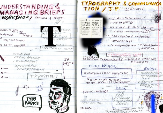
Before starting any project it is useful to define terminology:
http://www.collinsdictionary.com / www.britannica.com
Key names and works from the lecture:
◕ John Berger ‘Ways of seeing’ 1972
◕ Jan Tschichold film posters
◕ Cornel Windlin for Daniel Libeskind 1994
◕ Armin Hofmann
◕ Ralph Schraivogel
◕ SMA catalogue 472 Wim Crouwel 1970
◕ Typecon 2007 poster Marian Bantjes
◕ Graphic objects Mira Schendel 1967
◕ Spatial concept expectation Lucio Fontana
◕ Poster AG (Angiolo Giuseppe) Fronzoni Fontana 1966
g
 f
f
Notes: To make a research definitions of typography, what other authors think; “What is Typography?” by Peter Biľak; www.typotheque.com First try to make layouts in a catalogue way with kind of review of some chosen works (interesting to my mind) Ralph Schraivogel, Armin Hofmann and AG Fronzoni.
d
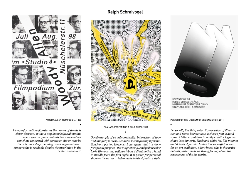
Ralph Schraivogel
v

Woody Allen Filmpodium, 1998
Using information of poster as the names of streets is clever decision. Without any knowledges about this event we can guess that this is a movie which somehow connected with streets or city or may be there is more deep meaning about regimentation. Typography is readable despite the inscription in the center is reversed.
Plakate, Poster for a solo show, 1998
Good example of visual complexity. Interaction of type and imagery is mess. Reader is lost in getting information from poster. However I can guess that it is done for special purpose – it is magnetizing. And yellow color looks like warning yellow ribbon. I didn’t notice a hand in middle from the first sight. It is poster for personal show so the author tried to make in his signature style.

Poster for the Museum of Design Zurich, 2011
Personally like this poster. Composition of illustration and text is harmonious, a chosen font is handsome. 2 letters combined in really creative logo: its shape is volumetric, black and white feel like magnet and it looks dynamic. I think it is succesful poster for an art exhibition. I don’t know who is this artist but this poster makes a strong feeling about the seriousness of the his works.
f
Layout of catalogue (first try)
Armin Hofmann


